From time to time, I'd like to help authors understand principles of designing a great book page or book website. This week, the folks at Schooold.com launched a beautiful, functional page for Hundred Thousand Heirs (A Financial Survival Guide for Recent High School Graduates), that I think is a great example to analyze.
Their Booklaunch page is a visual feast: lots of full-width background images in different color tones and a striking three-dimensional book cover to lead off the page.
Here are 5 take-aways from their page design:
1. Legibility
No matter how gorgeous the content, if someone cannot read about your book it will really affect their enjoyment of your page as well as their desire to purchase or download a copy.
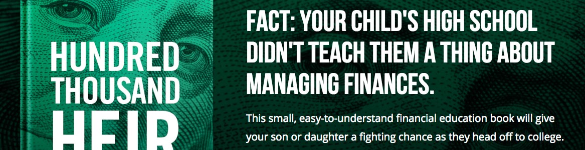
On this Hundred Thousand Heirs page, the detailed background images are significantly darkened to allow the white text and colored buttons to really pop off the background. The top section has a dark gradient to make the green button stand out even more.
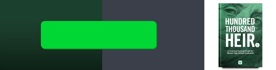
If you are going to use a background image, you might need to darken it down to improve legibility. Conversely, if you want to use dark type on lighter backgrounds, you would need to amp up the brightness on your background, somewhat like this:
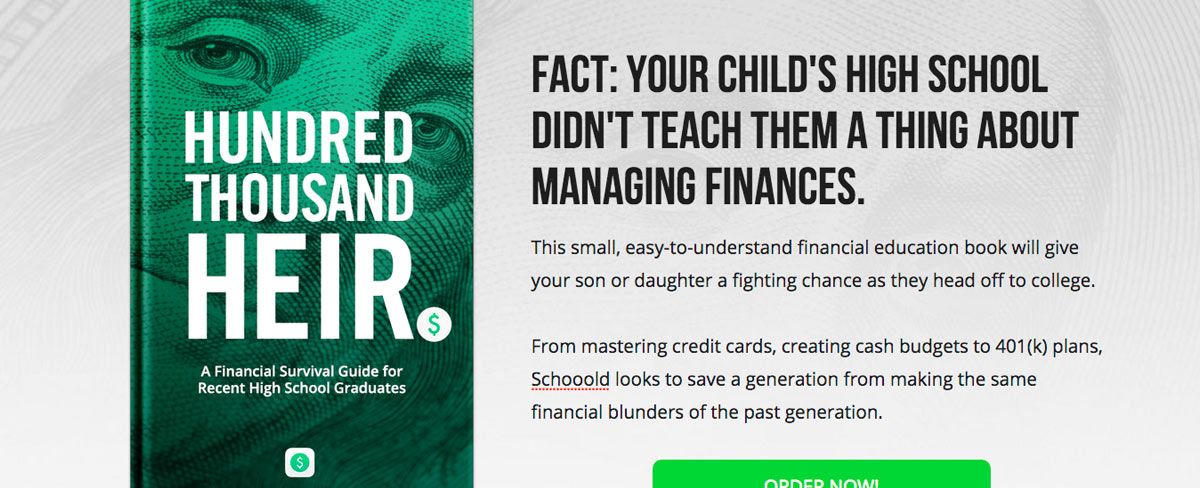
Regardless of dark or light backgrounds, colorful or not, make sure your words can be read.
2. Color Contrast
The bright green ORDER NOW! button is the brightest, vibrant shade in the top area. For a reason! Commonly referred to as your Call-To-Action (CTA) button, this button should be the most eye-catching item in the viewing area, drawing a visitor to click (take action).
3. Complimentary Color Palette
The designers of this page selected a color palette that works cohesively with the most important asset on the page, the book cover.
The easiest way to pick a color palette for your site? Remember: simplicity is key, don't go hue crazy. Select 2 colors that are already in your cover design. Add a lighter or darker variant of those two colors (for a total of 4). If you need, pick neutral colors like white, gray or black as a final option. And don't forget the first point on legibility!
4. Font Choice
While Booklaunch's default font (Open Sans) is flexible and modern, it might not be the best font for your book. Schoold chose to replace their headline font with Bebas' bold, strong, upright and condensed forms. This not only echoes the strong typography on the cover of Hundred Thousand Heirs, but also invokes a much different tone than the wider, rounder, more casual shapes of Open Sans. It makes the "fact" read more factual and official.
Choose the typeface that represents the tone of your book's message the best.
5. Short and Sweet
There are only 5 content sections on this page, so, some of the default sections have been de-activated and hidden.
Don't have a book trailer yet? Still waiting for some great endorsements or a new author headshot? Don't let that delay the launch of your Booklaunch book website! Hide sections that you don't need or have great content for and reactivate them whenever you need them.
The best day to start marketing your books is TODAY.
Bonus: Capture your Audience with Premium Tools
The 5 takeaways describe the beautiful design of their book page, but the folks from Schoold are doing a couple additional extra things to really boost the effectiveness of Booklaunch as an audience building tool.
Email Signup: Having a reader sign up on a communication list is them giving you permission to contact and engage with them further. Email communication has been found to consistently be twenty or more times more effective than any social media outreach.
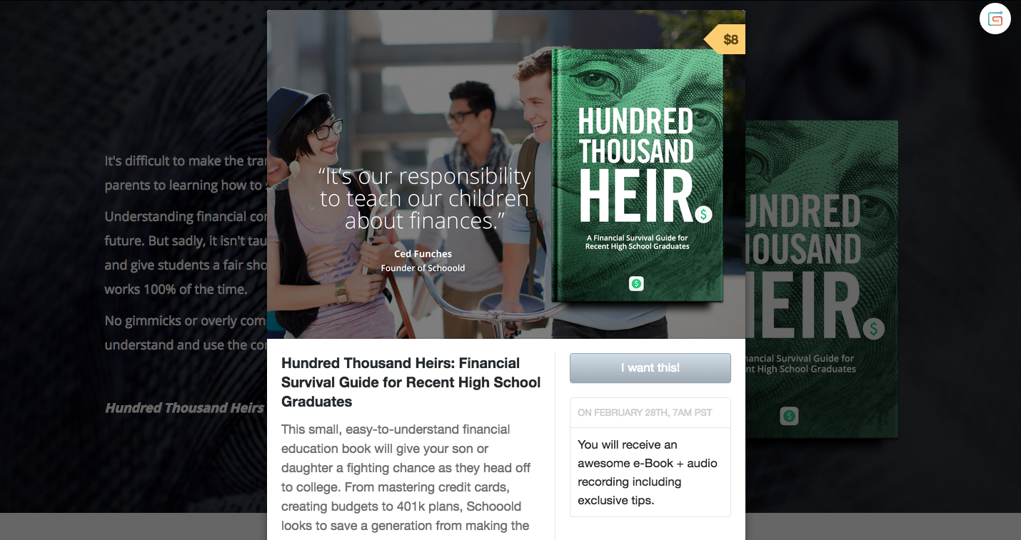
Gumroad Integration: Gumroad is a tool for authors to sell products directly to readers—you don't have to send a page visitor away to Amazon or another vendor purchase page. When someone clicks the Gumroad purchase button, a modal window pops up right on top of the Booklaunch page. This can lead to higher sales conversion rates and more control.
You can access these and many more pro-level tools by upgrading to our Premium feature set.
I would love to know if these articles are helpful! If you have any questions or comments about design, color, type, or just want to say hello, feel free to send me a note at ben@booklaunch.io. Thanks!